Ad blocker detected: Our website is made possible by displaying online advertisements to our visitors. Please consider supporting us by disabling your ad blocker on our website.
Archive for discussions from 2010. Please post new discussions in the appropriate forum.
Moderators: neps, Matthew, Michael Pajaro
-
Kn1ghtboy
- Rookie
- Posts: 61
- Joined: Wed Oct 01, 2008 2:56 pm
- What year did the original Knight Rider start: 0
- Location: SSC
Post
by Kn1ghtboy » Sat Apr 24, 2010 7:26 pm
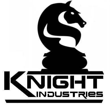
I was making a NEW Knight Industries logo & came up with 2 variations. I thought I'd post them & see what you all think about them.


-
Slade
- FLAG Assistant
- Posts: 855
- Joined: Sat Mar 21, 2009 3:04 pm
Post
by Slade » Sun Apr 25, 2010 1:00 pm
They look good to me

"See ladies,what happens in Vegas,stays in...KITT"
"Fate rarely calls upon us at a moment of our choosing"
-
Kal-el4
- Operative
- Posts: 207
- Joined: Fri Jan 30, 2009 2:57 am
Post
by Kal-el4 » Wed Apr 28, 2010 1:32 am
sweet logos man! awesome work!
-
TurboBoostMan
- Operative
- Posts: 178
- Joined: Wed Jul 22, 2009 3:14 pm
- antispam: No
- What year did the original Knight Rider start: 1982
Post
by TurboBoostMan » Wed Apr 28, 2010 11:13 pm
very nice!
"One Man Can Make A Difference" - Wilton Knight
-
WIBoomer1
- FLAG Recruit
- Posts: 296
- Joined: Mon Jul 28, 2008 1:00 am
- What year did the original Knight Rider start: 0
- Location: WI
Post
by WIBoomer1 » Thu Apr 29, 2010 12:20 am
I think you have talent, so don't take this the wrong way...
...but it's like one of those optical illusions, which do you see, the young lady or the old woman?
I see a snake more than a knight...
-
knightfever
- Operative
- Posts: 191
- Joined: Sat Aug 16, 2008 3:58 pm
Post
by knightfever » Thu Apr 29, 2010 10:10 am
WIBoomer1 wrote:I think you have talent, so don't take this the wrong way...
...but it's like one of those optical illusions, which do you see, the young lady or the old woman?
I see a snake more than a knight...
That might have been his intention since the snake became the symbol for the Knight Foundation and KI3T in the new series. I saw the same thing but thought he was trying to merge the two series.
-
Kn1ghtboy
- Rookie
- Posts: 61
- Joined: Wed Oct 01, 2008 2:56 pm
- What year did the original Knight Rider start: 0
- Location: SSC
Post
by Kn1ghtboy » Thu Apr 29, 2010 1:38 pm
Thanks for the words. It's just a rough draft. I'm adding an EAR but trying to figure out a few options.
I actually did this for extra credit for my CIS class. I just fiddled around with it & added the Knight Industries to it.
I had thought that maybe over the 25 years of the Foundation & Dr. Graiman resurrecting it, that I'd make a new logo - JUST FOR FUN!
I'll post others that I've made with different lettering styles. I used the "SLEEPING POD" font & thought about just a regular everyday used font too!
I'll post as soon as I upload them to my computer here at home.
"LAR"
-
iKITT
- Recruit
- Posts: 43
- Joined: Tue Jan 26, 2010 8:56 pm
- antispam: No
- What year did the original Knight Rider start: 1982
Post
by iKITT » Thu Apr 29, 2010 9:27 pm
It's a great start, but adding an ear definitely would make it look more horse-like. Maybe adding in a mane-like design to the neck would also help make it more horse-like. I understand by looking at the image that you're trying to keep it sleek and streamlined so that it fits in with modern times, so if you can somehow come up with a flowing design on those terms, you'll have something! I might also suggest you smooth out or completely edit out the small "fang" on the horse's muzzle.
These are just my opinions/critique and if you wish to disregard my commentary, by all means do so! I mean nothing negative by them, and wish you luck on this project and its final draft.

As an artist myself, I know it's sometimes hard to hear what's wrong with your picture, but it can also be really awesome to hear input from others as well.

-
Kn1ghtboy
- Rookie
- Posts: 61
- Joined: Wed Oct 01, 2008 2:56 pm
- What year did the original Knight Rider start: 0
- Location: SSC
Post
by Kn1ghtboy » Fri Apr 30, 2010 2:53 pm
I wanna thank everyone who has commented on this. I look forward to what you all have said & suggested. Even if it's neg/pos, it helps one build more uniqueness in learning & listening to make it look presentable to those who view your work. I welcome anything anyone has to say. I thought about using this as a cover sheet to make a KNIGHT INDUSTRIES employee handbook for fun. Using material from the original KNIGHT RIDER TV Series to the present KR08 Series. Just thinking about it, not sure what may come of it.
No more delays, here's the latest LOGO:

-
Kn1ghtboy
- Rookie
- Posts: 61
- Joined: Wed Oct 01, 2008 2:56 pm
- What year did the original Knight Rider start: 0
- Location: SSC
Post
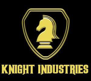
by Kn1ghtboy » Mon May 03, 2010 2:18 pm
I did one more just because...

-
hoffman95
- Operative
- Posts: 135
- Joined: Thu Mar 19, 2009 3:38 pm
- What year did the original Knight Rider start: 0
- Location: Scotland.UK.
Post
by hoffman95 » Tue May 04, 2010 1:13 pm
Wow cool! GREAT logos. How did you make them did you use a special program.I hope you make more and id like to see experiments with different colours.
-
Avenger95
- Operative
- Posts: 118
- Joined: Wed Jun 25, 2008 9:48 pm
- What year did the original Knight Rider start: 0
- Location: Pendleton, OR
-
Contact:
Post
by Avenger95 » Wed May 05, 2010 1:11 am
I plan on getting a KI logo airbrushed onto my car for my car project. So far these have given me a few more ideas.
...... []Knight Avenger Guardian Enforcer[] ......
-
Slade
- FLAG Assistant
- Posts: 855
- Joined: Sat Mar 21, 2009 3:04 pm
Post
by Slade » Wed May 05, 2010 2:14 pm
They look good to me,I would put them on my car
"See ladies,what happens in Vegas,stays in...KITT"
"Fate rarely calls upon us at a moment of our choosing"
-
KI4T
- Rookie
- Posts: 87
- Joined: Sat Jul 25, 2009 1:00 pm
- antispam: No
- What year did the original Knight Rider start: 1982
Post
by KI4T » Thu May 06, 2010 8:41 am
I dont like it, dunno it looks.... even more like KR 2008 like the real logo of the foundation from KR 2008
Knight Rider 4 ever!!!!!!!
Sry for my english, im from Germany.
-
Kn1ghtboy
- Rookie
- Posts: 61
- Joined: Wed Oct 01, 2008 2:56 pm
- What year did the original Knight Rider start: 0
- Location: SSC
Post
by Kn1ghtboy » Sat May 08, 2010 6:22 pm
I decided to update the lettering some & make a few adjustments.
Thanks for all the comments. Even the bad ones! No harm in your opinions!
I thought I'd add a RETRO VERSION just because I'm a KNIGHT RIDER FAN of both the series!

-
Slade
- FLAG Assistant
- Posts: 855
- Joined: Sat Mar 21, 2009 3:04 pm
Post
by Slade » Sun May 09, 2010 1:54 pm
Nice
"See ladies,what happens in Vegas,stays in...KITT"
"Fate rarely calls upon us at a moment of our choosing"
-
lunchmeat
- FLAG Recruit
- Posts: 256
- Joined: Tue Dec 02, 2008 1:36 am
Post
by lunchmeat » Wed May 12, 2010 11:59 am
Well done! I myself made a new version of the Knight Logo, which is actually my profile picture now. I really like the finished version of your artwork - my only suggestion would be to center the chess piece in the image, instead of centering it over the "night" area of the word "Knight". I see the effect you're going for, and it looks good, but a bit off somehow. Perhaps instead of centering the chess piece, you could extend the top boundary of the "K" to break the line and draw more attention to the piece's centering?
Just my two cents. I really like the style of this.
If I am destroyed... ...so shall you be. -KARR
-
corlando52
- FLAG Recruit
- Posts: 365
- Joined: Sat Aug 30, 2003 9:47 pm
- What year did the original Knight Rider start: 0
- Location: Long Island, NY
-
Contact:
Post
by corlando52 » Wed May 26, 2010 6:48 pm
Hey, where did you get that gold logo from? Do you mind if I copy it? I'd like to get that embroidered onto my car mats.
I've made it a bit simpler and black and white, reverse image. The black will end up being dark to medium brown, on tan "doeskin" mats, and put in my real KITT.

Thanks!
Chris
-
Kn1ghtboy
- Rookie
- Posts: 61
- Joined: Wed Oct 01, 2008 2:56 pm
- What year did the original Knight Rider start: 0
- Location: SSC
Post
by Kn1ghtboy » Sun Jun 06, 2010 3:06 am
My latest update of the LOGO! I think this is the last!

It started out really well...blah - plain, but after toying around & listening to you all, this is what I've came up with...hope you all like it!

-
Sky_Blue_Civic
- FLAG Operative
- Posts: 1214
- Joined: Sat May 31, 2008 8:17 pm
- What year did the original Knight Rider start: 0
- Location: Hanging out with KITT in SPARTA!
Post
by Sky_Blue_Civic » Mon Jun 07, 2010 7:05 pm
It looks great! In fact, it would look more than great enough to be used on the actual show! I actually wish it was!
Congratulations!By reading this signature,KITT's AWESOMENESS has increased by ONE POINT!
So far KITT's power level is OVER 9,000!!!!
Petition #9
-
trav. knight
- Recruit
- Posts: 47
- Joined: Tue Dec 14, 2010 6:46 am
- antispam: No
- What year did the original Knight Rider start: 1982
Post
by trav. knight » Thu Dec 23, 2010 1:00 pm
I agree, the logo deserves to get painted onto the side of a black and gold semi trailer...
1 man/ 1 car/ 1 diffrence....
1 man can make a diffrence,but you must decide to...