Ad blocker detected: Our website is made possible by displaying online advertisements to our visitors. Please consider supporting us by disabling your ad blocker on our website.
Archive for discussions from 2009. Please post new discussions in the appropriate forum.
Moderators: neps, Matthew, Michael Pajaro
-
ShadowKnight006
- Recruit
- Posts: 43
- Joined: Fri Apr 22, 2005 1:17 am
- What year did the original Knight Rider start: 0
- Location: Ohio
Post
by ShadowKnight006 » Sat Mar 07, 2009 8:55 pm
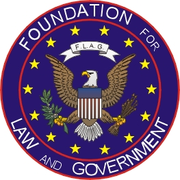
So what does everyone think of the new FLAG logo from the end of Season 1?

I myself am torn. I just think it should be a horse's head in there, not an eagle. So far we have gone from a horse, to a snake, to an eagle.
Looking for TKR!
-
_K3000_
- Operative
- Posts: 189
- Joined: Tue Oct 14, 2008 2:28 pm
- What year did the original Knight Rider start: 0
- Location: Brampton Ontario
Post
by _K3000_ » Sat Mar 07, 2009 10:12 pm
ITS FREAKIN AWESOME!

"We Can Make A Difference" Help Support The Show
-
Mr. M
- Rookie
- Posts: 50
- Joined: Sat Feb 28, 2009 11:10 pm
Post
by Mr. M » Sat Mar 07, 2009 10:15 pm
The chess piece worked better, because it was a "knight."
I'm torn to. The eagle symbolizes patriotism in the US, but the chess piece was really cool in itself. Plus, I don't think it was used for anything else.
By the way, when was FFLAG symbolized by a snake? Was that on Team Knight Rider?
-
Atlantean2005
- Recruit
- Posts: 25
- Joined: Thu Jan 29, 2009 2:53 pm
Post
by Atlantean2005 » Sat Mar 07, 2009 10:31 pm
I think it looks great! Hopefully we'll see more of it!
Mr. M wrote:The chess piece worked better, because it was a "knight."
I'm torn to. The eagle symbolizes patriotism in the US, but the chess piece was really cool in itself. Plus, I don't think it was used for anything else.
By the way, when was FFLAG symbolized by a snake? Was that on Team Knight Rider?
I think what they mean is the Cobra insignia that was seen around Knight Industries... Like the one that switched with Ford's Cobra insignia on the back of KITT when he changed to Attack Mode in the first ep. Personally, and I know this is kinda off topic, but I liked the Corba for K.I.
-
Mr. M
- Rookie
- Posts: 50
- Joined: Sat Feb 28, 2009 11:10 pm
Post
by Mr. M » Sat Mar 07, 2009 11:13 pm
Atlantean2005 wrote:I think what they mean is the Cobra insignia that was seen around Knight Industries... Like the one that switched with Ford's Cobra insignia on the back of KITT when he changed to Attack Mode in the first ep.
Ah, yes. The same one that is on NBC's Knight Rider website. Technically I guess that's for Knight Research and not FFLAG. Details, details.

-
Harry Singh Jr.
- Operative
- Posts: 131
- Joined: Thu Jan 01, 2009 6:21 pm
- What year did the original Knight Rider start: 0
- Location: South Ozone Park NY
Post
by Harry Singh Jr. » Sun Mar 08, 2009 12:21 am
I like the chess piece myself. But the eagle is cool:)
-
Knytemare
- Volunteer
- Posts: 19
- Joined: Thu Jan 15, 2009 12:57 am
Post
by Knytemare » Sun Mar 08, 2009 12:29 am
I can't remember (which sucks) but what was the original logo for FLAG? I thought the chess piece was only used for Knight Industries.
"I am the Knight Industries Roving Assistant, but you may call me KIRA for short."
-
Victor Kros
- FLAG Operative
- Posts: 1600
- Joined: Sun Sep 30, 2007 7:10 am
- antispam: No
- What year did the original Knight Rider start: 1982
- Location: Knight Manor
Post
by Victor Kros » Sun Mar 08, 2009 4:06 am
ShadowKnight006 wrote:So what does everyone think of the new FLAG logo from the end of Season 1?
I myself am torn. I just think it should be a horse's head in there, not an eagle. So far we have gone from a horse, to a snake, to an eagle.
- You know I saw this logo and I am fairly sure I know where their inspiration derived from, another popular 80s property that has seen new life. That's right check this little gem out below.

Let's see...
Eagle? - Check
Star? - Check
Shield Framing? - Check
That's right!
GI JOE: The Rise of Cobra.
I like the new F.L.A.G. logo and even better than the GI JOE one. It is infinately more impressive to me than the spin on the usual (and bland) Presidential seal. I say kudos to the design team on this one.
=VK=

-
Mr. M
- Rookie
- Posts: 50
- Joined: Sat Feb 28, 2009 11:10 pm
Post
by Mr. M » Sun Mar 08, 2009 2:27 pm
Knytemare wrote:I can't remember (which sucks) but what was the original logo for FLAG? I thought the chess piece was only used for Knight Industries.
The knight chess piece was used in the original series for FFLAG.
-
Garthe Knight
- FLAG Recruit
- Posts: 320
- Joined: Tue Nov 12, 2002 1:01 am
Post
by Garthe Knight » Sun Mar 08, 2009 2:50 pm
Mr. M wrote:Knytemare wrote:I can't remember (which sucks) but what was the original logo for FLAG? I thought the chess piece was only used for Knight Industries.
The knight chess piece was used in the original series for FFLAG.
I am not 100% sure, but if I remember correctly the Knight chess piece was Knight Industries, FLAG always had the eagle. But I have to check that to be certain.
-
Jay
- Rookie
- Posts: 83
- Joined: Fri Jun 06, 2008 2:56 pm
Post
by Jay » Sun Mar 08, 2009 3:13 pm
The Knight logo was tied to the Knight Foundation and Knight Industries. FLAG didn't really posses a logo - even the plaque in front of the HQ was just lettering.
"Alright Mr. KITT, let's burn some rubber!" Knight Song
-
WIBoomer1
- FLAG Recruit
- Posts: 296
- Joined: Mon Jul 28, 2008 1:00 am
- What year did the original Knight Rider start: 0
- Location: WI
Post
by WIBoomer1 » Sun Mar 08, 2009 5:37 pm
I like the new logo. The Eagle's head has the same sort of flaming that the Knight's head has, kinda...You almost can imagine the horse head in it's place...
-
weeezl
- KRO Podcaster (retired)
- Posts: 1346
- Joined: Wed Feb 06, 2008 11:43 am
- What year did the original Knight Rider start: 0
- Location: Weeezlville
-
Contact:
Post
by weeezl » Sun Mar 08, 2009 5:44 pm
I'm digging the new logo too!
-
gotigers1
- Rookie
- Posts: 76
- Joined: Mon Feb 18, 2008 1:30 pm
- What year did the original Knight Rider start: 0
- Location: Massillon, OH
-
Contact:
Post
by gotigers1 » Mon Mar 09, 2009 11:16 am
I like it as well.
-
ex812
- Recruit
- Posts: 29
- Joined: Sat Sep 27, 2008 11:47 pm
Post
by ex812 » Mon Mar 09, 2009 3:57 pm
FLAG never used the Eagle or presidentail logo until TKR. The Original FLAG used the Knight Chess Piece as seen on the semi. You can verify it by looking at Junk Yard Dog and seeing the Foundation for Law and Governement sign with the chess piece. Knight Industries on the other hand used the knight's head like on KITTs wheel but it had wings added behind the head. You can see this logo several times in the pilot especially when you see the semi at the end. It can also be seen on the technitions coveralls in Goliath
-
Mr.Marcus
- FLAG Recruit
- Posts: 310
- Joined: Thu Dec 04, 2008 10:13 am
Post
by Mr.Marcus » Mon Mar 09, 2009 4:06 pm
Pretty generic looking logo. Would have been better if they used the Knight chess piece. You know, Wilton Knight and all that stuff.
-
Victor Kros
- FLAG Operative
- Posts: 1600
- Joined: Sun Sep 30, 2007 7:10 am
- antispam: No
- What year did the original Knight Rider start: 1982
- Location: Knight Manor
Post
by Victor Kros » Mon Mar 09, 2009 6:09 pm
ex812 wrote:FLAG never used the Eagle or presidentail logo until TKR. The Original FLAG used the Knight Chess Piece as seen on the semi. You can verify it by looking at Junk Yard Dog and seeing the Foundation for Law and Governement sign with the chess piece. Knight Industries on the other hand used the knight's head like on KITTs wheel but it had wings added behind the head. You can see this logo several times in the pilot especially when you see the semi at the end. It can also be seen on the technitions coveralls in Goliath
- Actually the Knight Industrires knight's head on the gullwing wheel of K.I.T.T. differed greatly from the knight head and plume on the first semi in the pilot and on the technitions jackets.


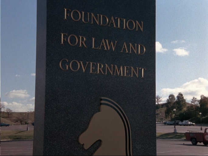
ex812 is correct that the knight head was used as part of the signage for F.L.A.G. in
Junk Yard Dog and you could debate whether it was an actual "logo" or not for F.L.A.G. itself. Also note that in
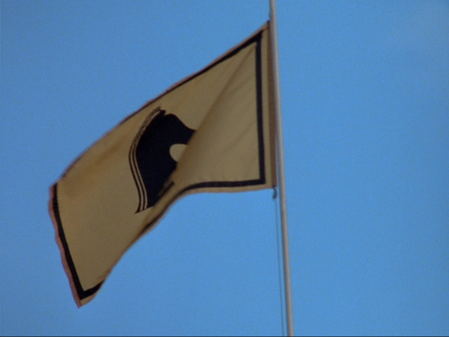
Junk Yard Dog the facility where K.I.T.T. is rebuilt is not at the usual mansion where gold and black flags also showed the chess piece as viewed in
Goliath Returns.
Additionally the very first "knight head" design to be seen in Knight Rider was on Michael's blue track jacket in the pilot (while he's talking to Wilton after jogging to get back in shape after his surgery) then the original KI semi logo is revealed on the back of his jacket. You can find examples of these logos in
The Knight Rider Companion along with others under the logo guide section of the book.
=VK=
-
lunchmeat
- FLAG Recruit
- Posts: 256
- Joined: Tue Dec 02, 2008 1:36 am
Post
by lunchmeat » Mon Mar 09, 2009 7:54 pm
I personally really like the new logo. I love the angles of the shield and the contrasting shades that comprise the eagle. I also really like the lettering.
Overall, this was a hit for me - a hint of the original presidential seal logo, but different enough to stand out and modernize. The only thing that I would like to see is a colored version - this one is grayscale because it's a background watermark. I see a lot of gradients in there - there are a lot of different zones that could work well for color. Then again, color could really really screw it up, so maybe it's better to leave well enough alone.
I think that this logo is fitting - that way, if Knight Industries ever makes a return, there will be a separate logo for that entity.
If I am destroyed... ...so shall you be. -KARR
-
PHOENIXZERO
- FLAG Special Ops
- Posts: 2363
- Joined: Wed Jul 19, 2006 6:20 am
- What year did the original Knight Rider start: 0
- Location: MI
Post
by PHOENIXZERO » Mon Mar 09, 2009 7:56 pm
I'd imagine that the Knight's head such as what was on the steering wheel was the logo for Knight Industries and the chess piece the logo for the Knight Foundation, which IIRC, funded F.L.A.G.
The new and again improved evil's advertisement is currently too long and too badass to display here. But let's just say that with now 50% more evil, this **** is great!


-
Milo
- Recruit
- Posts: 43
- Joined: Sat Feb 07, 2009 5:16 am
Post
by Milo » Tue Mar 10, 2009 10:13 am
this one was used too

-
J_Spaced
- Recruit
- Posts: 36
- Joined: Wed Nov 05, 2008 3:35 am
- What year did the original Knight Rider start: 0
- Location: Norwich, UK
Post
by J_Spaced » Tue Mar 10, 2009 10:55 am
Victor Kros wrote:
If you speak up in support and favour of this logo, are you flying the "FLAG flag" flag?
Sorry, I'll get my coat...
J
-
evangeline5432
- Volunteer
- Posts: 9
- Joined: Mon Aug 18, 2008 5:02 pm
- What year did the original Knight Rider start: 0
- Location: USA
-
Contact:
Post
by evangeline5432 » Tue Mar 10, 2009 11:49 am
I think its pretty cool.
-
Samborghini
- Rookie
- Posts: 97
- Joined: Tue Oct 28, 2008 4:19 pm
- What year did the original Knight Rider start: 0
- Location: Blackpool, England, United Kingdom
-
Contact:
Post
by Samborghini » Thu Mar 19, 2009 10:33 am
I think the Knight Industries 'Chess' logo should stay and the new 'Eagle' is an update but it's too 'futuristic' as none other 'Real' organisations use a futuristic logo so really I think it should stay the same as a tribute to the original.
-
KiTT316
- Rookie
- Posts: 77
- Joined: Tue Sep 10, 2002 1:01 am
- What year did the original Knight Rider start: 0
- Location: Near Philly, PA
Post
by KiTT316 » Thu Mar 19, 2009 2:47 pm
anybody got the skills to reproduce it in high resolution?

-
NN11
- Operative
- Posts: 126
- Joined: Sun Mar 22, 2009 5:53 am
Post
by NN11 » Mon Mar 23, 2009 10:54 am
I was hopefull that i was able to see FLAG logo on the last episode for a good and perfect ending to a
partly-ruined show. i was sad to see that the flag logo has changed from a knight to a eagle. i thought
they will make it up for ruining the show with a cobra badge(making the word knight less meaningless than before).
i was dissapointed to see sarah checking old FLAG data with a new logo.
It is not logical.
they had the best chance possible to redeem themself but they didn't.


