Page 1 of 1
opinion on cd cover I am working on
Posted: Wed Feb 08, 2006 9:13 pm
by theevolved1
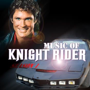
Im working on making a Knight Rider Music Collection featuring all the 80s music from the various seasons. Im probably gonna do 1 cd a season. Here is what I have so far for season 1 ideas... Its the same just one is a bit more tweaked than the other and I cant decide which one I like better so I figured who better to judge than fellow knight rider fans

Photo 1
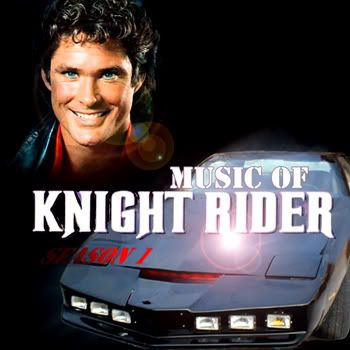
Photo 2
Posted: Fri Feb 10, 2006 6:44 pm
by KRFAN
cant decide myself

Posted: Fri Feb 10, 2006 8:27 pm
by MLAM
First one i think, a tad too much lense flair on Hasselhoffs cheesey pose

Posted: Fri Feb 10, 2006 8:36 pm
by knightrider#1fan
First one
Posted: Fri Feb 10, 2006 8:53 pm
by Kitzira
First one..
In other notes... Ouch, lense flare. x.x
Also the words Season 1 get lost in the black behind Kitt. Perhaps outlining them in red or similar color will make it popout more.
Otherwise, nice photoediting.
Posted: Fri Feb 10, 2006 10:05 pm
by theevolved1
I see your point about the season one kind of being lost in the black... However I was kind of going for a look of KITTs scanner I dont know if anyone picked up on that?
Posted: Fri Feb 10, 2006 11:08 pm
by 5* General
The first one.
Posted: Fri Feb 10, 2006 11:20 pm
by neps
If thats what you are doing, how bout reversing the gradient so the dark part is on the hood, as the hood is lighter.
And distorting the font like that, yikes. You should find a font with an Italic version vs distorting. Not only would it look nicer, but you're kinda trashing someone's art. (people make fonts!)
Posted: Sat Feb 11, 2006 12:35 am
by theevolved1
Im not so sure I understand what you mean by distorting fonts?
Posted: Mon Feb 13, 2006 6:55 am
by GTiGirl
The first one.
But I think the "Season 1" would be better in the top, in the black part
