Page 1 of 2
Contest 2 - Fan Art! - Winners Announced!
Posted: Wed Apr 13, 2005 4:00 pm
by neps
We've announced our winners!
Continuing with our giveaway filled Tenth Anniversary special, we present to you our second contest!
This time around will take a little more than filling out a form. For this, we present a fan art challenge. The task? Redesign the Knight Industries Logo. Use whatever you want, the new font, the old, or something completely different.
Entires must be posted in this thread, and recieved by 11pm EST on April 30th.
Prizes? Of course, this is a special fan art contest, so we do have some goodies!
Grand Prize - 1 Copy of the Season 2 DVD
First Runner up - 1 $10 Gift Certificate to 80stees.com
The selection of the winners has yet to be finalized. It will either be by private ballot, or by selection by the moderating staff. Will let you know at least one week before.
Good luck and happy entering!
Posted: Thu Apr 14, 2005 9:59 pm
by C_Matt
Question: Are multiple entries allowed?
Posted: Fri Apr 15, 2005 1:06 pm
by Knightuser
Can't you extend the term cause it would allow users to present better works.... ?

Posted: Sat Apr 16, 2005 6:20 pm
by Lyn
I didn't know that this website's been around for 10 years at all until you said something about it!
I only began visiting your site last August.
Hopefully this contest will bring forth good results.....
Posted: Mon Apr 18, 2005 11:25 am
by neps
C_Matt: Yes, we'll accept multiple enteries but lets keep it to like your top 5 ideas.
Knightuser: The three week term should be a good amount. It may be a bit unfair to change the date because there may be people already working on something, and we don't want people to have more time than others. If the turn out is low, then maybe we will extend it, but again. not sure if that is fair.
Thanks Lyn!
Posted: Tue Apr 19, 2005 7:30 pm
by Knight224
Question: Is this for art art (as in drawings, etc.) or computer art?
Posted: Tue Apr 19, 2005 9:21 pm
by neps
Either one will be accepted.
Posted: Wed Apr 20, 2005 11:53 am
by theevolved1
I got my entry

Posted: Tue Apr 26, 2005 7:14 pm
by daroga
I seem to be setting a trend for myself by entering these contests with things that are sort of within the guidelines.
The idea for this entry is that it is what Knight Industries opted for their promotional look to be. In 21st century America, when no one played chess anymore, everyone was confused by the "little horse thing" as their logo. By this point, having made a name for themselves with thier amazing car, they recruited people with an image that most everyone would know, KITT.

Knight Industries Wants You!
And yes, this was taken during a crazy run in the dorm as we were entering the
http://www.touchingisgood.com/ (Nintendo DS) contest. Creepy, eh?
Tim
Posted: Tue Apr 26, 2005 10:18 pm
by Phoenix915
o.O Very frightening. KITT's being pushed by a disenbodied hand! AHHHH!
Anyways, here's my entry in glorious black and white. You'll have to click
here since for some reason I can't get it to show up in my post. :/ And yes, it was done in MS paint.

Grrr. Anyone have any idea why this ain't working?
EDIT: Finally got my entry up. Keep scrolln' down.

Posted: Wed Apr 27, 2005 3:26 am
by FuzzieDice
The hand on KITT - looks like a hand of protection or affection.

Posted: Wed Apr 27, 2005 11:34 am
by daroga
FuzzieDice wrote:The hand on KITT - looks like a hand of protection or affection.
That's one of the reasons I kept text off of it, because it's kind of open to interpretation.
I just went with one interp. so that it wasn't just this nebulous void in the contest
Tim
Posted: Thu Apr 28, 2005 10:08 pm
by Phoenix915

Okay, here's my entry. Sorry if it's huge. I Ffinally figured out why it wouldn't post--apparently the message board doesn't display .bmp files (aka: MS Paint). Took me a little while to figure out.

Like I said, it's in glorious black-and-white, partially because I like it in B&W, and also because I don't have a fancy program like, say, Photoshop to color it in with.
Posted: Fri Apr 29, 2005 2:05 am
by Toni Nummela
Phoenix915 wrote:Okay, here's my entry.
Hmm.. Would you prefer KITT being a Porsche
There's definitely some Porsche feel in this logo
Nice idea. See
Porsche Logo for reference.
Posted: Fri Apr 29, 2005 3:27 pm
by Phoenix915
Really? I think they don't look too similar. The Porshe logo's in color, for one thing.
I'm happy with T/A KITT, but I've always felt that a black Corvette KITT would rock.
Posted: Fri Apr 29, 2005 4:06 pm
by Toni Nummela
Phoenix915 wrote:Really?
OK, not really
I must admit I took me quite a while to think through that connection. I just thought if you used the Porsche logo as an inspiration. It was just some crazy thought when I was thinking myself from where to start to create my own logo for the contest.
Posted: Fri Apr 29, 2005 4:26 pm
by Toni Nummela
And here it comes...
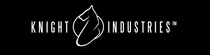
Done in a hurry because there was some other work that kept me busy (hopefully you'll see that also soon). I'm quite happy with it. I hope someone else likes it too.
And (don't take the following too seriously
) here is actually where my inspiration came from. Sorry for the bad picture quality, I was in a little hurry to leave the Knight Mansion before Glen came upstairs

Unfortunately I didn't get pictures of the other pages...
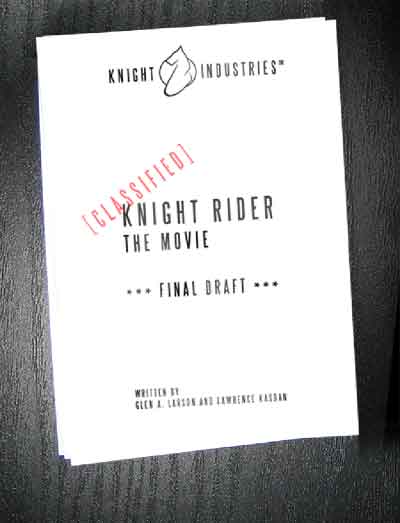
Hopefully someone got it

Posted: Fri Apr 29, 2005 4:42 pm
by daroga
Ooh, I like that! Is there a significance to the "2" look to the horse? My mind is making all sorts of possible connections, but I thought I'd ask in case it's just a design with no meaning behind it
Tim
Posted: Fri Apr 29, 2005 5:02 pm
by Phoenix915
We really need a 'clapping' smilie, but this'll have to do:

That's an amazing logo!
Too bad you couldn't get the rest of the script.
Posted: Fri Apr 29, 2005 6:41 pm
by FuzzieDice
Here's my almost late entry.
I had this idea of a robotic knight with KITT's eyes or something. Kinda a cross between Knight Rider, the Black Knight Monster from Scooby Doo, and Battlestar Galactica.
Of course I did want a futuristic theme, yet simple.
I created this image entirely by hand (mouse and graphics tablet) in Paint Shop Pro 8.1. I used simple lines, air brush tool set at a soft circle for the eyes, and gradients and drop shadowing for depth. I did not use any special filters or plug-ins except the balls and bubbles feature in PSP 8 to make the head portion more 3D.

Enjoy!
Posted: Fri Apr 29, 2005 6:49 pm
by FuzzieDice
Toni Nummela wrote:
Done in a hurry because there was some other work that kept me busy (hopefully you'll see that also soon). I'm quite happy with it. I hope someone else likes it too.
And (don't take the following too seriously
) here is actually where my inspiration came from. Sorry for the bad picture quality, I was in a little hurry to leave the Knight Mansion before Glen came upstairs
Unfortunately I didn't get pictures of the other pages...
Wow! That's awesome! Sleek and simple - just like KITT.
Posted: Sat Apr 30, 2005 11:28 am
by theevolved1
Here is my entry I cant believe I almost forgot to post it lol

Posted: Sat Apr 30, 2005 2:01 pm
by FuzzieDice
Wow! Cool! That horse looks wicked! Reminds me of KARR.

Posted: Sun May 01, 2005 11:31 am
by neps
Since the board was down a bit yesterday I'm gonna extend this till the end of tonight at midnight. Hope everyone is okay with that.
Posted: Sun May 01, 2005 12:43 pm
by FuzzieDice
Not a problem for me. I think it's only fair.